Modern Blocks Inspired by Flooring
I’ve got a craving and only modern quilting can satisfy it! I’m craving simple, free form, non-traditional, improvisational piecing. I also want to work fast with precut fabrics in solid colors. I’m giving myself permission to do all of this and to be a student and experimenter again, not a teacher.
So for this project and blocks I’m allowing myself to piece however I want, whatever I want, and share it here for fun!
These first two blocks popped into my head last night after spending four straight days down on my hands and knees laying laminate wood floors. I got to thinking about the two most important rules of laying a floor:
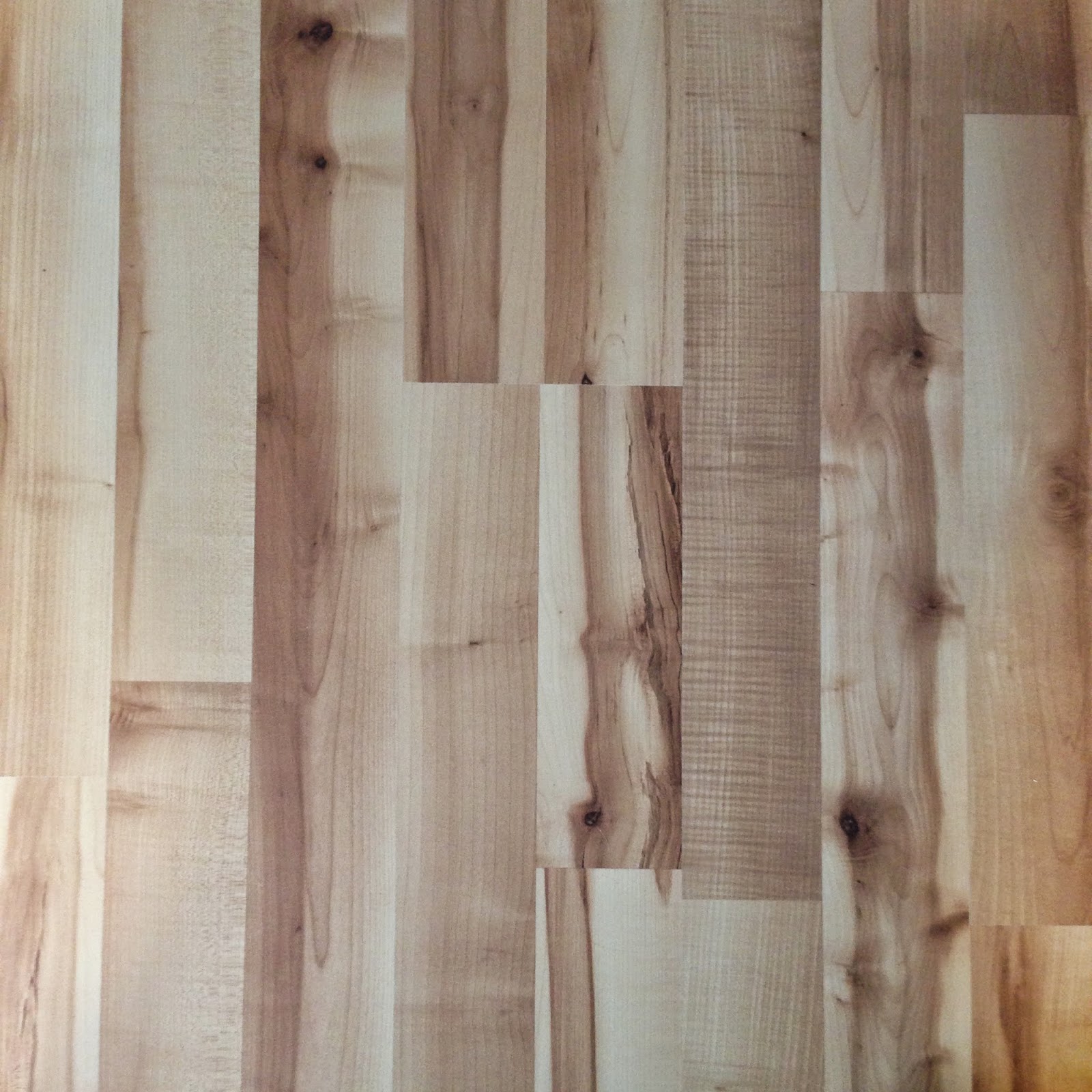 1. Keep the length of the floor straight across the room, even if the walls aren’t straight.
2. Stagger the cuts between boards so they don’t form straight lines across the room.
When I compare these rules to piecing, the only one that agrees is to keep the lines straight. When piecing traditional blocks, we usually want the seam lines to all match up perfectly, not be staggered like a floor. But what would a flooring inspired block look like?
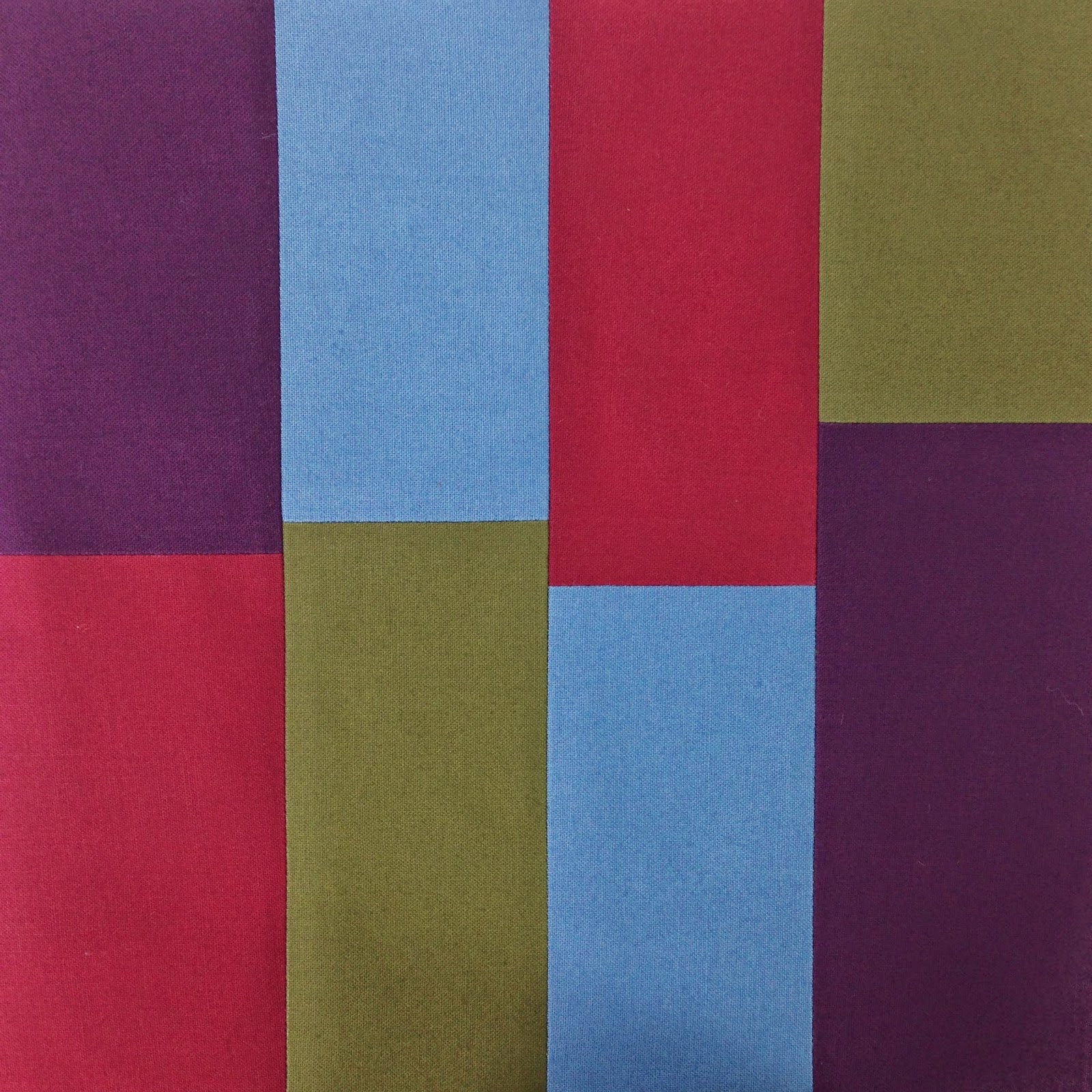
I couldn’t shake the idea so I decided to piece up a small block to see. If I followed the rules of flooring with staggered breaks in the planks of wood, then the blocks will look like this:
 |
| Modern Block #1 – Staggered Nicely |
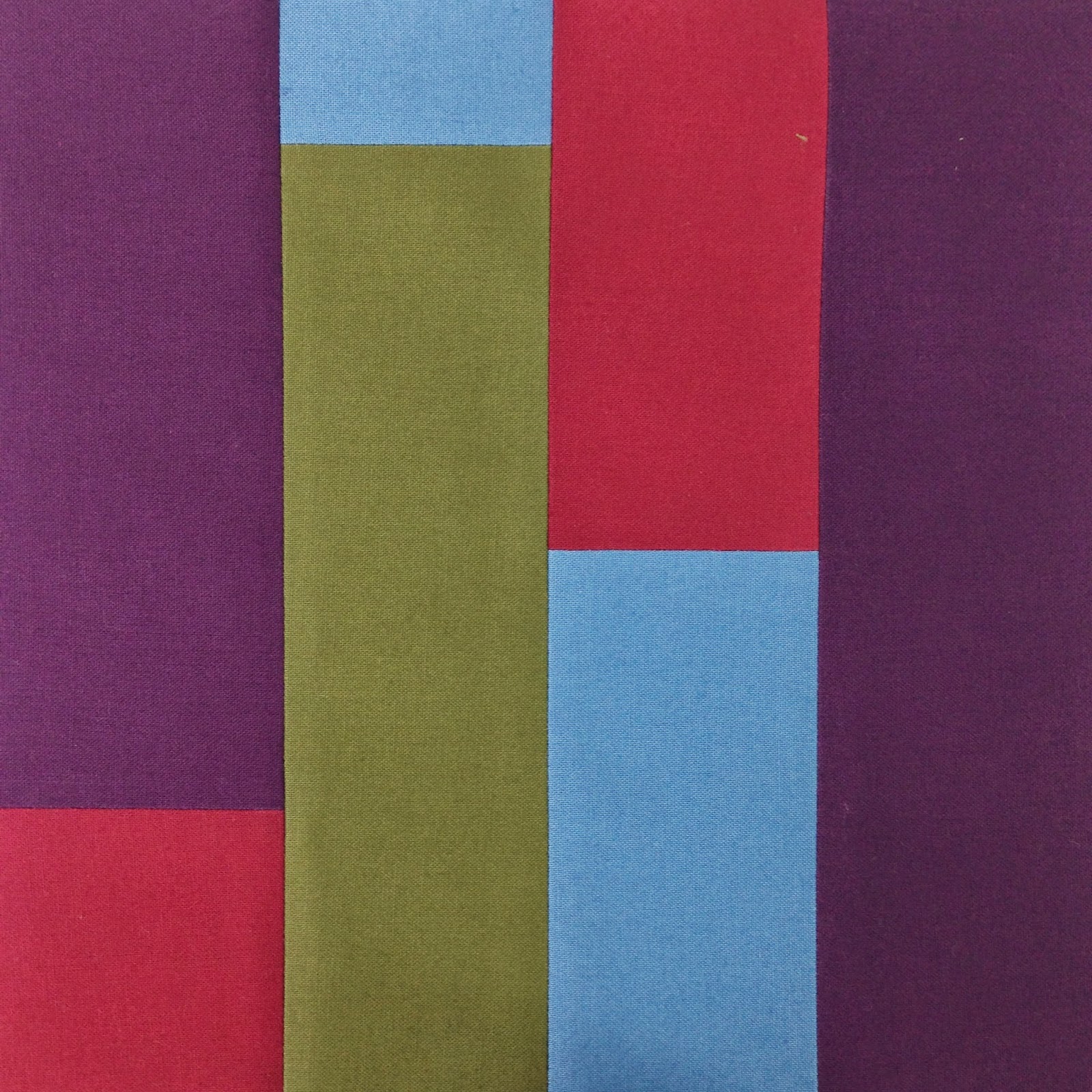
What if I laid the floor badly with the breaks lining up very close across the rows? What if I also pushed the edge of piecing and designed the breaks to be just slightly off? I pieced another set of strips and came up with another block:
 |
| Modern Block #2 – Badly Laid Floor |
I find this last one slightly unsettling. The quilter in me wants the seams to line up evenly across the block. The floor layer in me wants the breaks to be more staggered as above. This block is all wrong, wrong wrong!
But doesn’t that also make it wonderfully right?!
What do you think? Which block is your favorite and why? Would you need to piece a third with the seams all matching in the middle?
It seems I can’t get enough of wood floors because I’m now considering piecing a wood flooring inspired table runner. I guess if you spend enough time staring at something it eventually becomes inspirational!
Let’s go quilt,
Leah Day
The first one is the better one for me. The second one the seams are too close that it just looks and feels wrong.
I like the first block better. The second one looks like you were trying to line up the breaks and just couldn't manage.
Definitely #1. I wouldn't like block 2 as flooring either!
I agree with you. The first block is more aesthetically pleasing because of its complete "randominity." The second looks like a random wannabe, therefore it is wrong. I can so relate to the connectivity you see between the floor and the fabric. Such connections are so organic, since we know that all things in the universe are somehow connected. 😉
I agree all the way as a floorer and quilter. Quilting those blocks will be fun?
Staggered is for me! I've put down hard wood floor before so i definitely like the first block better!
Isn't it weird how such little things feel totally right or totally wrong? It was actually fun to get these blocks so close but off. It felt a bit weird to not be matching seams!
Yeah, I think I'm going to be piecing more flooring inspired quilts. At least a table runner with the staggered pattern down the length. Staring at wood for too many days has clearly done a number on my brain. Either that or I just inhaled too much sawdust!
I prefer #1 too – it is more interesting because of the definite separate shapes while #2 looks like it is meant to be matched but the quilter got it wrong. Your floor looks nice too!
I'm with the rest I like no 1 best, no 2 is just too close to look right and it's slightly unnerving to look at. I like things to match up usually but I think no 1 is great.
the first one for me I think the second the joins are too close together, love the fabric too
I like the first one best. Way to go modern!
Maybe its because I'm just contrary but I would like to see a bigger bit of number 2. I think the 'pattern' that would emerge in a bigger piece would end up not being as discordant as everyone is feeling from just that little snippet. Hum, I think I have a jelly roll of solids looking for some inspiration. C
I wouldn't give up on the 2nd. It's not the end of the story. It matters about the other blocks that go with it. Are they plain? Are they matched? Are they like block #1. Of course the quilting makes all the difference. Block #1 is OK, but I have seen it before— nothing surprising or particularly interesting. Of course, it isn't "done" either.
I actually like the second one better, because there's more of a color balance. Asymmetry doesn't bother me at all. Love that you got your inspiration from laying floors. You just never know where ideas are going to originate!
My first thought was that if you are doing blocks, then the seams between them will line up (I can't picture how to make that random) and that it would be a poor contrast to block #2.
Then I read the comments, and looked back, and I do rather like #2. The seams are staggered enough to not be a mistake, and it looks more balanced to me. (I may be bothered by the unpieced purple strip on the right of #1.)
OR: you could cut random lengths, piece them end to end, and sew it like a "1600" quilt. You might get color next to itself, but it would be random!
I like the first one. The second one would drive me crazy thinking I had not matched my seams even though it was on purpose, but what if you staggered the. At least 1 inch apart? Just a thought.
Hi Leah! I like the 2nd one for the fact that my eyes don't have to move "all over the page" to see where the breaks are! It's interesting how each one of us sees it a different way!!