Your Favorite Quilting Colors
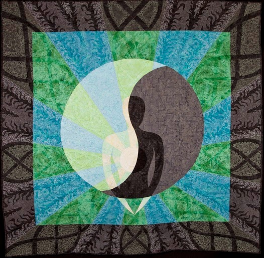
You can read more about Leah’s creation of Shadow Self here.
The greens and blues, paired with varying hues of charcoal and gray, have always appealed to me. I cannot definitively say why but I can absolutely point to nature as a source of inspiration. We recently had a fun discussion about color choice and personal preferences on the Building Block Quilt Along’s facebook group.
So today I wanted to share a few pictures of some of my favorite images from nature–these are all shots taken by me featuring fish and various plant and animal life I’ve kept over the years in aquariums, both fresh and saltwater.
This is a discus freshwater cichlid, hailing from South America. The metallic teal along the fins is simply beautiful.
A soft coral called a green polyp coral. Believe it or not, but corals are not plants, but animals, deriving energy via photosynthesis through symbiotic algaes living within the corals called Zooxanthellae.
Another soft coral, the common name and species escaping me at the moment. The picture is almost ten years old.
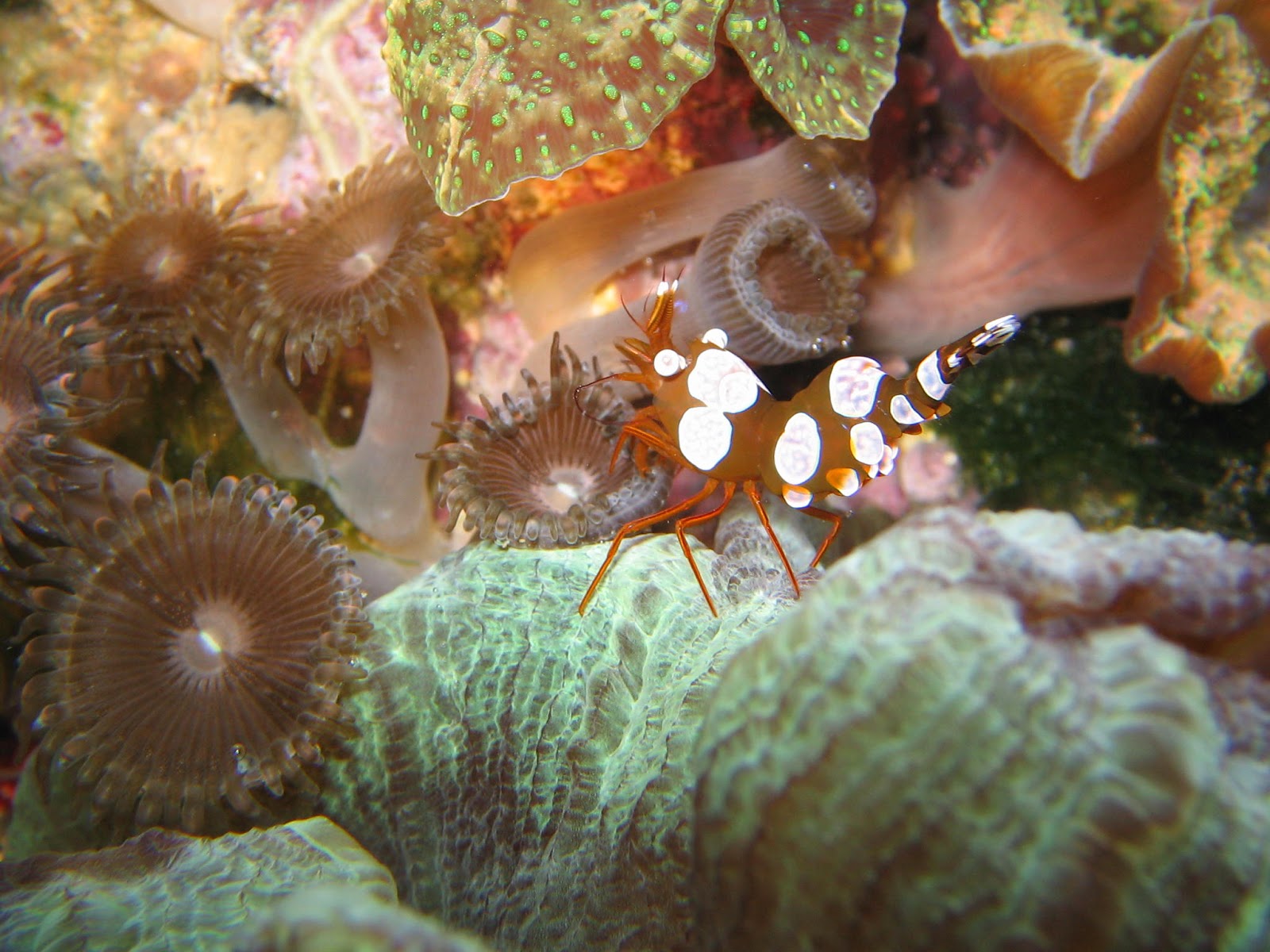
A marine shrimp, aptly given the common name “sexy shrimp.” Zoanthus button polyp soft coral to the left of the shrimp, and an open brain LPS coral on the bottom.
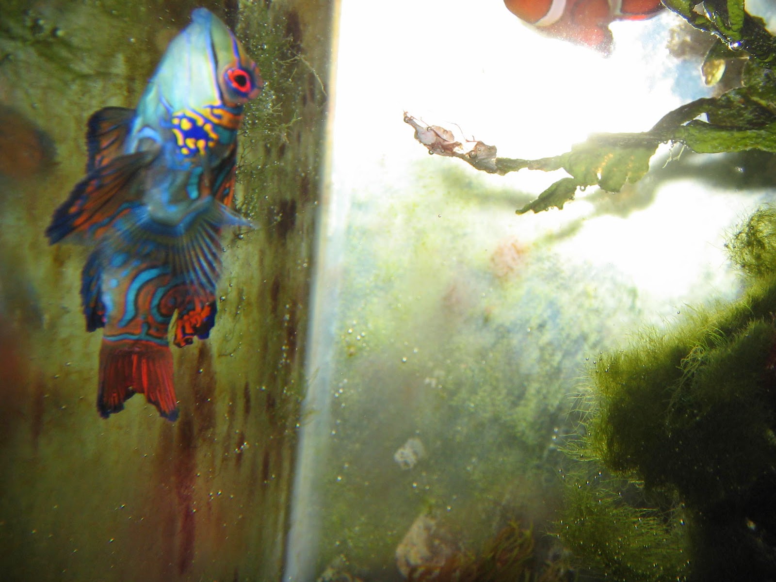
A green mandarin dragonette, the prize of my reef collection. Absolutely stunning colors and always a tank show-stopper.
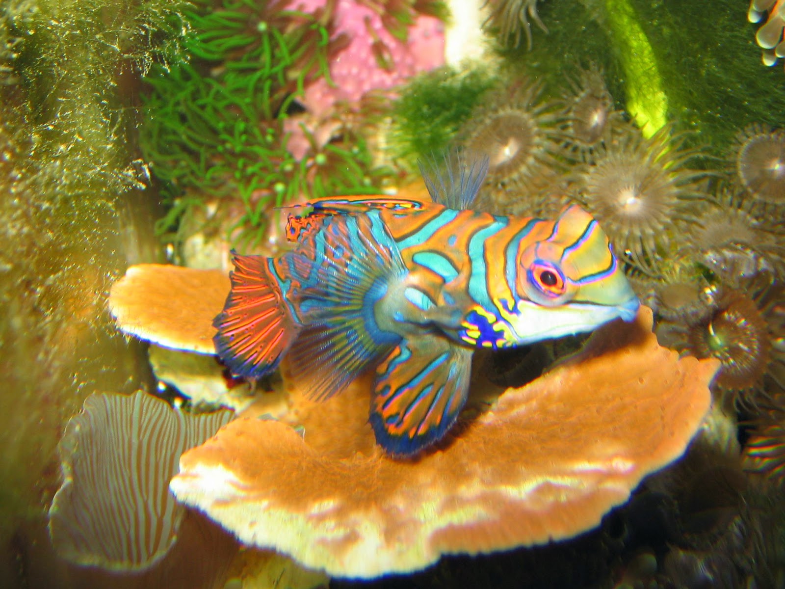
The same male mandarin again hovering over a stony polyp coral.
This shot was of my 1-gallon “pico” reef contained within a glass flower vase, and the candy purple color on the rock is actually an encrusting coralline algae.
Lots of bright and beautiful colors on display above! But you also see dull grays, browns, and even rust colors. These are critical in creating the perfect contrast that makes up the visual feast.
These are examples of things I find really beautifully, color-wise, and what I’d love to put in a quilt. Also the patterns of the fish and corals, as well as textures, are inspiring.
And now I’d like to share two things, a couple of American cultural icons, that beautifully capture the mastery of colors.
The first image is an old vinyl album color by Bob Dylan, The Freewheelin’. If you are not familiar with it, a simple Google search will bring up the picture. Note the washed out colors of both the sky and the street, in contrast to the central beige and forest green of the two coats. And of course there is the signature light blue VW microbus to the left.
The last thing is the season 6 finale of AMC’s Mad Men. This is an amazing and arguably perfect display of colors, not to mention cinematography (and I’m not even talking about the moment when Judy Collins’ Both Sides Now comes in). From the little boy’s bright red popsicle to the deep maroon reds inside Don’s car, these colors are like gemstones set against the imposing gray and cracked pavement, November Pennsylvania sky, and industrial smokestacks and streams of trailing smoke above Don Draper and his kids’ heads.
If you haven’t experienced the scene, do yourself the favor. It is simply incredible, a standalone piece, and something very close to perfect. In fact, as much of a fan of the show as I am, I sincerely wished the series had ended on that note, as it will be impossible to top or even equal.
To conclude, be careful with the bright, seizure-inducing Skittles colors, and don’t be afraid to heavily lay in the grays, the earthy browns, the autumn (and even dead of winter) tones. Without these colors, the natural jewels of the fish and corals displayed above would not have such powerful effects.
See you next week!
Josh


Love how you create the shadow in your quilt 🙂
Wow, what a great post!! The photos are amazing. Oddly enough, I'm working on a project that is teaching me about color values, as I'm usually drawn to mid-tones, and when placed side-by-side they just blend regardless of color. Your point about including grays and browns and such to accent and balance extremely bright hues is well taken. I'll keep those in mind during my project now.
This is an awesome instructional post, Josh. I am going to save it, as it includes excellent advice on colors. Who thought to just look around you! And MadMen, a very favorite show of mine, definitely shows thoughtful consideration when setting a scene, both in clothing a nd background imagery. Thanks!
Thanks for sharing the color tips Josh! I often overlook the importance of grey. I love to see color in quilts but have a hard time choosing them myself. The fish pictures really show what you mean. I will definately make sure my quilts have some neutral in them so the colors pop more.
Great pictures, Josh! Thank you for sharing!
Colour has a deep affect on our emotions, doesn't it. Contrast can be startling and delicious. As a photographer as well as quilter I look for both. Thanks for sharing, Josh.