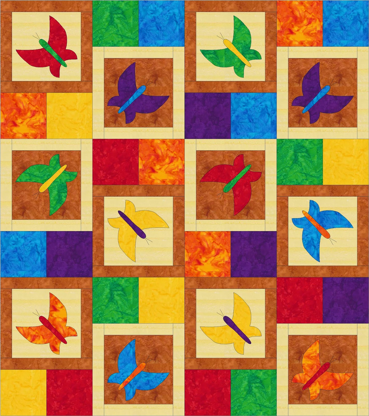
Dancing Butterfly Rainbow Colorway
I’m still sticking with Island Batik fabrics because I can easily design with them in EQ7 and the fabric colors are coming out very accurate to what you could expect in your finished quilt.
For this layout the butterfly background colors are two soft neutrals – Island Batik Copper (light brown) and Butter (cream). After setting these colors I started thinking about more bold contrast like white and black or black and red, so that might be another color way to try next!
For the design blocks and butterflies, I decided to use the entire rainbow to make it super bright and colorful. The colors used above are Island Batik Candy, Nasturtium, Daffodil, Apple, Waterfall, and Wisteria.
The key I find to working with lots of colors is to be generous with yourself – allow yourself to try any color combination you can think of, but try not to debate the merits of one over the other (that can trigger the regret from the Paradox of Choice).
Instead look at this as a fun experiment in creativity – how many possible colorways could you create? Have fun and be adventurous!
Let’s go quilt,
Leah Day
Would love to see the black and white layout. Thanks for all you do!!
This quilt in red black and white would look interesting as well. Might need a fourth color though.
Obviously these are personal choices, but I do like this combination! I think you could also go with a 'baby' quilt type look with soft versions of the colors above like: aqua, celadon, peach with soft yellow and whites as neutrals.
I also think it would be fun in a more neutral color scheme say of a variety of soft yellow prints with that one aqua or teal butterfly popping out!