Cover Art Drama
It’s that time again! I’ve finally reached the point in the new book From Feathers to Flames to design the cover art for the book.
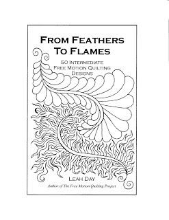
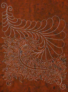
This one has been particularly challenging because I wanted to do something very different from the other book. I wanted this design on the cover with a dark red background: There’s only one problem with this – I couldn’t color in the white feathers or flames without it messing everything up! So rather than continue to tear my hair out and scream at the computer, I decided to quilt the design on fabric instead:
 This STILL didn’t work because I didn’t cut the fabric big enough and it needs more space at the top for the words to fit, and the thread really isn’t showing up enough. Grr Grr Grrr!
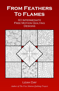
So finally after all this fighting the cover, I just decided to go back to the cover I used for From Daisy to Paisley and change out the designs and fiddle with the background to make the pretty red color:
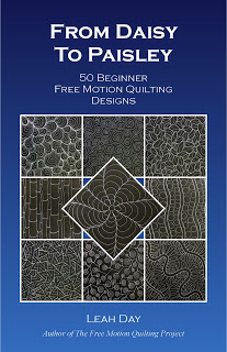
 The big difference is this time the designs are graphed rather than quilted for this book. For a simple comparison, here’s the cover of From Daisy to Paisley:
 So whatcha think? I think the white graphs show up much better and on the cover and look very nice. My original graphic design will still be used on the first page of the book so it’s not going to waste either.
One thing I know after designing and self publishing two books, cover art is a tricky business. Big publishers probably have a whole team of people fiddling with things here and there to get it perfect. For this book it’s just been me playing with different ideas and seeing what works.
I’m pretty pleased with this, though I wish it hadn’t taken 3 months to realize my original idea wasn’t going to work. Chuck it up to another lesson learned and a reminder to never forget to KISS – keep it simple stupid!
Feel free to share your opinion in the comments below!
Leah
Added note – I realized only after the comments started coming in that I forgot some important details:
This new book is going to launch next month! The digital version will be available on August 14th.
The physical, spiral bound version will first prelaunch on September 1st, then probably start shipping towards the middle to end of September. It always takes longer to get the print version just right so that date is still flexible.
Yes, there will be a new Intermediate Level DVD that will launch at the same time! You can see the quilt featuring all 33 designs taught in the DVD right here.
And finally, yes, there will be a 3rd mini book and the three will make up a set of beginner, intermediate, and advanced designs. This last book will be a golden yellow color so the three will tie nicely together.

I like it! The black really makes the stitching show up. Thanks for sharing.
As much as I love your quilted swatch, I think you've got the right idea; it's a nice parallel to the other book cover so that's good marketing.
Hi Leah,
I really like the quilted version. I think in the image of it you posted it looks fine – you can extend the fabric in Photoshop and no one would know where the real fabric and where the cloned extension left off, so you have enough room for the lettering, which can also be added in Photoshop.
Just a thought.
I liked your feathers and flames concept, but the cover showing the new designs on white with the red background is sharp and it links the two books together. Looking forward to adding it to my collection!
I like it 🙂
Love the original design and was sad to read that you couldn't make it work. I was about to offer some help (I can do anything on CorelDraw) then read farther that you are using another idea… actually a good one since it looks like your first volume. I'm a lurker, but have enjoyed all your fillers and have been praying for you concerning your personal struggles. You are so transparent… I want to send a hug along with congrats on your progress as a quilter!
I like what you decided for the cover. I makes the two books look like part of a set. What color is the cover of number three going to be? :} I am glad you can still use the other beautiful graphic inside. It is splendid. Did you get it right on the first try? Did you do any marking? Really nice.
I like how the cover turned out. It is nice that the two books look like they belong to a set. What color is the cover on book number 3 going to be? :} I am glad you are able to include the graphic in the book. It is beautiful. Did you stitch it that well in one try? Was it completely free hand? I love your drive and your execution!
I like the way it is like the other but different….I love anything that is a "series" and with this cover, same basic design but different "fill-ins"—I would recognize as yours immediately! Maybe all your new books should have the same basic design but different pics in the squares!
Oh, I forgot to ask: When will it be available for purchase?
I am all about keeping with the first books "look" and since my favorite color is Red: I love the Red multiple stitch cover.
You are a marvel! Congratulations.
Thanks for all your input and comments!
To answer the question asked many times – the book will launch digitally on August 14th.
It will then launch physically (the spiral bound version) sometime in September. Printing always takes more time and has many more headaches than anticipated so the date is still flexible on that one.
Yes, this is the 2nd of a set and the last book (From Square to Spiral) will have a golden yellow color.
This way the three main mini books will be the basic, primary colors: blue, red, and yellow.
Thanks for all your input!
Leah
I like the cover design – and I also think its important that it IS very similar to your first. Branding, consistency, a recognisable "this must be part of the series". Individual books on separate topics probably could do with individually designed covers – but a continuing project like this needs some familiarity. Good luck with it. And as a non quilter I may also be tempted by this one too, if its available digitally.
I agree that a set of books should look similar, although I really love the design you have shown us! I'd love to be able to quilt like that. As for my sewing machine, I have a whole room devoted to my sewing/quilting and it usually is cluttered with several projects. Right now I am busy with three different t-shirt quilts and am in the process of quilting them. I use the Janome 7700, set in a table. We don't have A/C and the windows in this room are all on a west side wall, so I have to take plenty of breaks in the afternoon. I sew all the time, not just seasonally. I love sewing/quilting/and in the evening, knitting. I walk our dogs for exercise and I swim to cool off! You are amazing. Thank you for sharing so much of your talents!
Hi Leah. I do love your initial design – but as you say it has to work as a book cover. I really like your final cover design – I love the red and the white graphs of the patterns. I think it is nice to have the books in a similar format – makes it look like a set which is great. C
Yippee! I like the cover design and can't wait to get my book. I use the beginner book quite a bit and love the inspiration it provides.
This comment has been removed by the author.
Oh, I wish you could get the graphics to work. The feather to flame is gorgeous.
I think the cover you came up with looks great!