Testing Shadows
Lately I’ve hinted at a new technique I’ve been playing and I’m finally ready to share it with all of you.
I’ve been playing and testing shadows, or more specifically, how to add shadows to my quilts.
 The inspiration for this is the book Casting Shadows by Colleen Wise.
This book was recommended to me by Cathy Miller, the Singing Quilter, and she was right, it’s an absolutely excellent book!
Not only have I been playing with shadows, I’ve also been looking at them, and looking for them much more in my daily life.
If you find yourself bored, standing in line somewhere, look around!
Check out the way people cast shadows, the way objects stand out from one another, and why our 3 dimensional world looks 3 dimensional. Chances are shadows are involved!
It’s actually kinda fun to look at the way shadows work and the way graphic artists have tried to mimic them on billboards and advertisements. Shadows in an advertisement can make words appear to pop out at you, rather than sitting flat on a page.
flat quilts into optical illusions that appear 3 dimensional.
I’ve been playing with adding shadows to my wholecloth quilts and goddesses so they appear more dynamic and dramatic.
See, there’s a problem with wholecloths which you can immediately pick up with this photo:
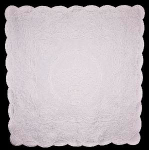 This is a picture of The Duchess, one of my first white, wholecloth quilts. You can’t see much of the detail or elaborate Georgian motifs, can you?
Some quilters will try to get around this by quilting with beige or brown thread so it stands out slightly against the white fabric.
Even with darker thread, wholecloth quilts require special lighting that casts shadows off the surface in order to pick up the amazing designs. Even with special lighting, the picture still needs to be very big to pick up the details.
So my theory is that if I add shadows to the wholecloth motifs, they will stand out much more noticeably, photograph better, and compete better in shows.
The trouble I’ve been having is figuring out exactly how to cast the shadows, what materials and techniques to use on wholecloth quilts.
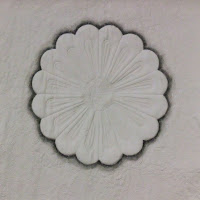
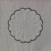
Using the information from Casting Shadows book, I’ve created 2 Dresden plate blocks:
 These are 14″ wholecloth quilts created from my Dresden plate stencil.
After working on them, I’ve stood back and asked myself “Which looks like a real shadow? Which is more realistic?”
Both were created differently. This first one was painted BEFORE it was quilted with Shiva Paintstiks following the directions in the book.
 I was a little troubled with this technique because I ended up stitching white thread over the shadow area. If you get really close to it, it looks weird with the white stitching on top.
I could easily fix this problem by simply changing thread color through the shadow section, or I could add more paint on top after the quilting was finished.
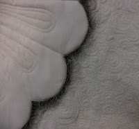
This second one was painted AFTER it was quilted with colored pencils. It still needs to be sealed with textile medium in order to be color safe.
 I like this technique a bit better because it covered the thread completely. You also have more control over the colored pencils that you have over paintstiks.
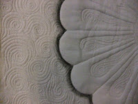 But colored pencils aren’t as good at subtle shading. I’m afraid this shadow looks more like a stripe of color around the block, not a real shadow.
You can also run into the problem I ran into with Release Your Light. Painting, even small shadow areas, can be very time consuming and is not a fun thing to start after finishing all the quilting on a quilt.
Keeping all of this in mind, which Dresden plate looks more like it’s hovering over the surface of the quilt? I’d really love your opinion, so let me know in the comments below!
I think this technique needs a bit more playing with. I might even increase the visibility of the motifs with black pigma pens or black thread.
I’m off to ponder shadows some more!
Leah Day
Note Added April 14th: Thanks to everyone who commented and shared tips, opinions, and suggestions on where to go next with this technique.
To answer the question about shadows, yes, typically shadows are cast to one side or the other, but the effect I was going for was to have the Dresdens appear to hover over a background with a light source behind.
For most wholecloths, the motifs are so complex that casting a shadow to the side could be pretty tricky to keep realistic.
I think I’m going to play more with the paintstiks and a larger sized wholecloth. I might even go with gray instead of black as many suggested.
Thanks a bunch for all of your input! I love trying new things, but sometimes it’s really hard to make an objective decision when both blocks look so much alike.
The block done with the Shiva stick looks more like it is "hovering". It looks more like shadow, the other one just looks like stitching in the picture. In fact it looks like satin stitching! Of course it probably looks better in person.
Hi Leah
from the pictures the shiva paintstik looks more like a shadow as it does'nt have such a hard line.
Did you mask the main part off or just apply by eye to the edge, brush or straight from stick?
Paintstiks are a technique that I am longing to try!
Look forward to more on this subject.
Peter
I think the first shadow block looks more realistic.
Textile Medium? What's that and where can I get some. My DH hand drew some beautiful artwork on fabric with artist quality colored pencils and I've been afraid to do anything with it because I knew whatever I made would fade with repeated washings.
Personally I think the one done with the the color pencils looks more like a shadow, but I also think the stitches overtop of the color create a beautiful effect that could be used for something else aka not shadows.
The first one with the paintsticks looked like a real shadow to me. The second was just a stripe, but you may be able to get the same effect with more work with the pencils. I know you are just experimenting but both were rather stark not subtle like a real shadow which we hardly notice.
I like the one with the colored pencil better but it still is such a stark contrast to the white. How about a softer gray color instead. Interesting concept.
Sandra on "Sandra's Snippits blog has two good tutorials on using Jacquard Colorless Extender #100 to set the color. Thought you might be interested in reading them.
http://sandraleichner.com/wordpress/colored-pencil-applique-tutorial/
http://sandraleichner.com/wordpress/2009/06/26/a-new-discovery/
By the way – I love your blog!
I don't really see a "shadow" with either piece. Shouldn't your shadow only be on one side. What I mean is, if I look at the book the cover, the photo on there shows a strong light source coming from the top right causing a shadown on the bottom left. This gives it the illusion of 3D.
I think both of the techniques shown in your photo have potential. I do think they are too dark for white fabric, i.e. too intense. I think they'd look better more subtle, as shades of grey not black.
Just some thoughts!
Michele
To me the first one looks more like the motif is floating. That is the one on the left in the side by side shot, the one you used the paint stick on.
I think the first one looks a little more realistic, but the difference (at least looking on a computer screen) is really minimal.
I am wondering if you used a different color to shadow on white? To my eye (and the computer screen)it looks as though they are outlined in black. It makes them "pop" out, but were you looking for a more subtle shadow?
I have this book and it is excellent. I've tried working with Paintstiks and even though many people enjoy them, I find actually painting with a brush gives you much more control. I use textile medium and color pencils and use a brush to spread the color. It works very well.
Both techniques look interesting but too time consuming for me to try. Have you considered doing a stitch line (out line) of a different thread (I like the idea of a varigrated) Then instead of doing the shadow around the whole object do one side consistanty around the top, like your light souce was coming from the NW corner looking down. What would it look like if you did a denser quilting to darken the areas you want to shadow. Your work is something else and it is fun to watch you figure out what you want to do. enjoy the process. cw
I work my wholecloth quilts with black or starkly contrasting thread. I am primarily an embroidery artist, though. This seems so much more natural to me. I also use trapunto accents.
To me, the paint stick one looks more like a shadow because it is darker right next to the plate and then lighter as you go farther from the plate. The colored pencil one does seem to be just a band of color around the plate.
Have you tried using colored fabric or batting underneath your whole cloth in certain areas you want to highlight or be more visible? A lady in my guild is doing this and they look great. I'm not sure how they photograph, but in person it is a really nice effect.
the first one definitely creates a better shadow illusion. Great book, isn't it!
HI Leah, I like the first one better, where you did the shadow painting first and the did the quilting on top. I actually like the look of the white stitching on the shadow, it makes the shadow seem to flicker. like there is movement in the shadow. Thanks for sharing. Suzanne
Love your exploratory nature!
I vote for the paintstiks one too. More effective because it softens and lightens as it moves out from the plate. For more control try applying with a small stencil brush.
With paint or pencils, I use any other color but black for shadows -often the complementary. Orange plate, indigo shadow. Makes the plate pop more. Mix colors for more shadow interest. For white, figure out if it's yellowish, pinkish, bluish or what to figure out what colors to use in the shadow.
Study items in shadow change. Study how artists portray shadows.
I look forward to seeing where this takes you.
I was able to pick my own bottle of that Textile Medium Colorless Extender yesterday at Michael's thanks for mentioning it.