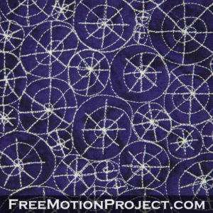
Free Motion Quilting Sand Dollar
I’ve been having a lot of fun playing with designs that overlap and cross many line to create complex textures. Here’s a design that overlaps a very simple design called Bright Star on top of another simple design called Peppermint Candy. The combination of these two simple designs really creates one funky Sand Dollar!

Yesterday I went to the hardware store and had the shelves and bars cut down for my new fabric organizer. I then got home and placed said bars into the system and found they were cut 1 1/4 too long. That’s what I get for trying to measure in the middle of the night!
Overall I would say that the redo of this room is worth it, but gosh, it’s annoying! The whole house is a real chaotic mess because of everything being torn out. I’m just looking forward to putting everything back in place, minus a whole lot of this stuff I’ve been hanging onto for years.
Now I’m off to get those poles cut back down again and do some grocery shopping. Working on this Sand Dollar design is making me crave seafood!
Inspiration – While writing the book From Daisy to Paisley, I realized I had very few Overlapping Designs. So I set about doodling and dreaming and created many new textures just by playing with the way lines can overlap to create new designs.
Difficulty Level – Advanced. This design didn’t make it into the book because it might be a bit tricky for a quilter just starting free motion quilting. There’s a lot of thread play and traveling over the center of each spiral and this can really give you fits if your thread is too thick or weak.
But if you’re using a thin, strong thread (like my favorite Isacord!), then this design really shouldn’t been too difficult. Just keep the simple shapes in your mind as you fill your quilting space evenly.
Design Family – Stacking. While I was attempting to create more Overlapping Designs like Broken Glass, this design really ended up working more like Stacking Designs like Pebbling because of the ways the spirals butt up against one another.
Directional Texture – No Direction. This design doesn’t have a huge amount of movement to it, but it’s very eye catching! Notice how the bigger Sand Dollars stand out from the others. Maybe this design would be best stitched with bigger spirals so they really get a chance to show off.
Suggestions for Use – I think this design would look awesome Section Quilted into the sashing of a quilt. It’s easy enough to fill the area, building from the center to the outside and because of the dense texture it creates it would certainly draw a lot of attention into an area that is usually left empty.
Let’s go quilt,
Leah Day

Hey, Leah!
I hope you are doing well today! I just want you to know that I've started my own blog and I give you a shout out in my first post. You can check it out if you want.
http://imakwiltnoob.blogspot.com