Shadow Self – Part 2
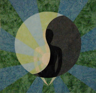
 Unfortunately the colors are not showing up quite as nice in this photo as they are in real life, but you can get an idea for how the green and blue work with the darker side.
The colors are actually a departure from my usual bright orange, yellow, and flaming red.
When I first thought of this quilt I wanted it to look more subtle with greens, blues, and maybe purple, but to still read lighter than the dark black and gray side.
Now, before I run off to start marking the quilting design, I have a question:
My original design did not have a border, but looking at it on the wall, I’m starting to think it needs one.
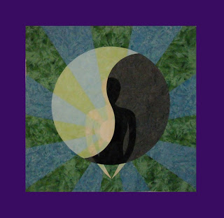
Thanks to the wonders of a simple computer paint program, I’ve played with auditioning two borders on the quilt.
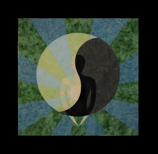
Here’s a black border, probably measuring around 8″ wide:

 Honestly I’m leaning towards the black, which would not be the matte black you see here, but a mottled black batik.
What’s really neat is if I did the black border, I could extend the quilting design out into the black, and since it will be stitched in light green and light blue thread, it will contrast nicely.
Hmmm….I’m going to think about this for a few days and come back to it when I’m sure.
If you have a definite opinion on which one looks best: no border, black border, or purple border, definitely share your opinion in the comments section below!
Let’s go quilt!
Leah Day

When you bought up the idea of adding a border my original reaction was "no, don't do it because it will stop the rays from flowing outward. Then, when I saw the black border I felt it really made the piece more coheshive, tying the black inner self with the border.
Lovely design.
I like the black border, but how about an additional very narrow border before the black in one of the lighter colors in the quilt? Sort of like in a double mat on a framed photo…just a thought.
I'm not an expert in art quilts but I like the black border. It looks like it is framed. (I use black frames for pictures in my house) Just my humble opinion.
I like the black border. The purple sort of washes out your colors and fights for focus with the center. The black really centers your focus on the center of the quilt and doesn't take anything away from it. With out a border the design sort of just falls off the edge of the quilt.
Okay, I just purchased some gradation fabric from SewBatik at the machine quilter's expo and it is dark grey on the bottom and light grey on the top, That would make an interesting border too. and then your shadow self would be darker on the bottom (or the top) which would mimic a transition. Just a thought.
I think the black border looks the best. This is truly a beautiful quilt. You have such unique ideas for your quilts and I love them. Happy Quilting
Only black binding?I do not know!
(My Englich is so bad – sorry!)
Jutta
I really like it with the border & I think the black one is my preferred
I'm going to differ from everyone else and say purple border. I like a border on it, I think it frames it nicely. But after reading your explanation on why you are making this quilt, I would choose something lighter than black to signify life away from the shadow in the centre. I think the purple that you have used on the computer is a little bright – it does overwhelm a bit – and you could try a darker, mottled batik purple and that would still show your quilting designs if you extended them from the centre. But whatever you choose, it's looking great!
I like the one with no border. It makes me feel like the rays can go on forever. Although the borders work, the "self" feels more contained – and I prefer the feeling of expansiveness.
Looks good so far. I love how the body really shadows in the yin yang. I like the effect of the black border. The purple one doesn't add anything for me.
I like the black border. I usually like 2 borders so it might be worth trying but I think the one black border looks great.
wow looks amazing!! I must learn
Sharon Schamber's Piec-lique technique too and I go also for the black border!
The black border is immediately appealing to me as I like strong colours and contrasts and the black gives the whole design strength and impact. However the title Shadow Self implies something more ethereal so maybe a soft green border may be more appropriate. Love the whole thing though.
Definitely the black. Beautiful quilt.
I vote black border.
I'm currently working with purple for someone, and it is very hard to use much of it – it is such a powerfully negative colour! So my vote is for the black – it will look so fantastic with the rays extended out into the border.
Is there any more information about the Pieclique method? I can only see products on their website, but there doesn't even seem to be information about what the product entails.
ately prefer the black. It draws your eyes into the centre and really emphasises the image.
I dare to go against the main opinion here and say: The black border makes me think that despite all the positive energy now flowing from your heart, there is black energy surrounding you, stopping all the good within you… As your lovely quilts say so much figuratively, it is important to stay in that mindset and make the border accordingly – what about continuing using the green and blue, perhaps in a darker tone and let the quilting pass on to the border, for the touch of infinity?
I like the black border MUCH better than the purple border and somewhat better than no border at all.
The black border seems a nice frame, a finish for the piece.
Black border.
I prefer the purple too. One the black, the design seems to sit inside the black, but on the purple, it pops out of it.
And whichever colour, I think a batik fabric would work well 🙂
Definitely the black. Piece is gorgeous! You go girl!
glen
Black Border is my vote
Just my opinion, but I'd love to see you finish this quilt with a black border with the quilting design extend out into it with the light green and blue thread colors like you mentioned. There's something very striking about light colored quilting on black.
I've been following and learning from your free-motion blog since last fall when I first started experimenting with machine quilting last fall. Love your work!
Thank you all so much for your comments! I did decide to go with the black border after all.
Hi Metanoia – The piece-lique technique is taught in all of the projects on that page of Sharon's site.
Just pick the project you like best to learn with. Her directions are very clear so it's worth every penny to learn from the master of the technique.
Let's go quilt!
Leah Day
Black border for sure. It makes the design really pop. Almost like it anchors the eye and brings it in to the heart of the design. Wow this WAS quick! Well done.
I definitely like the black / mottled fabric idea as long as it leans more towards the CHARCOAL end.. Too strong of a black will overpower the design you want the "self" to the focus and this will maintain your "shadow" motif.
I also like the idea of continuing the quilting design into the border with the green/blue threads. Excellent work! Please post some info sometime about the piece-lique technique. I'm interested in how it's done. Just a general idea so some of us will know if we are interested in purchasing Sharon's book for more detailed instructions.
oh..and don't hesitate! If the creative juices have you flowing faster than normal…just ride the wave and enjoy! You'll be wishing for days like these when you are stuck on a project. Chug along my friend, chug along!!!
Audra at AuraQuilts.com
I love this piece. It's your best so far. oh – and – I also like the black border best – it seems to make the rest even more peaceful.
If you decide to use a border, which I like by the way, use the black one, not the purple. It goes better.
If you do add a border, don't use the purple one. The black looks much better.