Day 135 – Cityscape
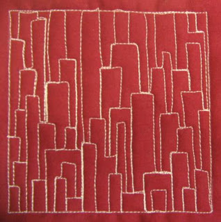
Here’s another cool geometric design I’m calling Cityscape:

Yesterday I spent most of the day fusing blue fabrics together to make the water section of My Cup Runneth Over.
I was feeling very frustrated about how slow this process is going. When I went upstairs to bed last night it was feeling like a big weight on my shoulders. I must get this quilt done….I must get this quilt done…
But then I started asking why?
Why must it be done right now? Why must I rush through it?
The only answer I could come up with is “I want to quilt, not piece.”
So for the next few days I’m going to stop fusing, piecing, and putting this top together and instead start designing the quilting designs that will be used on it.
I’ve learned from doing this to myself enough times that I can force it, force myself to grind through a project just to get to the part I want to work on, or I can stop pushing and just go do what I want!
It’s a good lesson to learn, but sometimes hard to remember. As Pepper Cory said in her lecture “It’s QUILT not GUILT!”
So I’m ditching the guild and just going to quilt!
Inspiration – I haven’t made a landscape quilt in a pretty long time, and I was thinking about the different landscapes we have in NC.
Of course it’s always fun to change from the typical, rolling hills / mountains vista for something more geometric and obviously man-made. Nature doesn’t usually run in straight lines!
Difficulty Level – Beginner. This is a very easy design of overlapping squares and rectangles. The trick is keeping the shapes consistently layered evenly so the design is consistent throughout.
As you can see from my sample, I had a lot of long, skinny buildings toward the top and that area didn’t look as good as the lower, more layered area.
Design Family – Stacking. This design is created by stacking and layering shapes, so really it can be stitched in any area of your quilt.
Directional Texture – 2 directions. Because the rectangles are worked largely in one direction, you end up with a very obvious horizontal / vertical texture.
Suggestions for Use – I think this would be a fun design to use as a contrast to very curving, fluid shapes.
You could even take a typical rolling hills / mountains landscape quilt and stitch Cityscape in the sky area for a very interesting design element.
Never hesitate to contrast textures! If you look closely at most plants you’ll find that all of them mix straight and curvy lines all over the place and they still manage to look beautiful.

and send in a picture to show it off.
Click here to support the project by visiting our online quilt shop.

Hi Leah…love your Goddess..I would really like to understand how you go about fusing your fabrics, and how you sew them when fused. Looks lovely to me! Enjoying the process, and all your posts. How you manage with a small child I dont know. Well done!!